
A churn prediction model scores customers by their probability of leaving, so retention teams know who to contact before it's too late. The metric that decides whether a model earns its keep isn't accuracy or AUROC. It's time-to-churn: whether the model flags risk early enough for a human or campaign to actually intervene. Everything below covers the data, model choices, and operational wiring that turn a churn score into saved revenue.
TL;DR:
- Focusing on early time-to-churn detection, not accuracy, is crucial for intervention windows that allow meaningful customer retention actions.
- Using behavioral signals like login drops and support activity provides more predictive power than billing data, especially 30 to 60 days before churn.
- Incorporating relational and graph data across accounts can improve AUROC by up to 26%, surpassing flat table models.
- Starting with simple models like logistic regression and escalating to advanced approaches only if they outperform basics ensures trust and interpretability.
- Prioritize fixing involuntary churn with payment retries before developing complex models, tying predictions directly to unit economics to justify investments.
Table of Contents
- What Churn Prediction Models Actually Measure
- Which Signals Actually Predict Customer Attrition?
- Which Model Should You Use: Logistic Regression, XGBoost, or Something More Advanced?
- How to Engineer Features and Handle Class Imbalance
- Which Metrics Actually Prove a Churn Model Works?
- How Do You Turn a Churn Score Into an Action Your Team Can Trust?
- How Do You Deploy and Maintain a Churn Model in Production?
- What Should You Prioritize First When Building This Out?
- Where to Learn the Technical Implementation
- What I'd Tell a Leadership Team Building Their First Churn Model
- Sources
What Churn Prediction Models Actually Measure
A churn prediction model is a statistical or machine learning system trained to estimate the likelihood that a given customer will stop paying, stop using, or fail to renew within a defined future window. That last part, the window, is where most teams get sloppy, and sloppiness here is what quietly wrecks the business case.
Before you touch a single feature, you need a clean label. And that means separating two very different problems that get lumped together constantly:
- Voluntary churn: the customer chose to leave, canceled deliberately, or simply stopped engaging past a defined inactivity threshold.
- Involuntary churn: a failed payment, expired card, or billing error ended the relationship without any decision from the customer at all.
These require completely different fixes. Involuntary churn is a systems problem, solved with retry logic, dunning emails, and updated payment methods, not a persuasive win-back campaign. Voluntary churn is a product and value problem that demands a different kind of model entirely, one trained on behavioral and engagement signals rather than payment failure codes.
Mixing the two into a single "churned" label is one of the most common mistakes I see in early-stage churn work. It muddies your class balance, dilutes your feature importance, and sends your customer success team chasing ghosts. Someone who lost their card isn't a retention risk. They're a billing fix. Treat them as the same problem and you'll burn budget on save campaigns that were never needed, while missing the customers who actually made a decision to leave.
Which Signals Actually Predict Customer Attrition?
Most churn models fail not because the algorithm is wrong, but because the inputs are shallow. Billing history alone tells you almost nothing about intent. It's a lagging indicator dressed up as a leading one.
The signals that carry real predictive weight tend to show up well before cancellation. Login frequency dropping off, feature adoption stalling, support tickets spiking, and a customer's internal champion leaving the company are common leading indicators, and login decline in particular tends to appear 30 to 60 days before a cancellation. That window matters enormously, because it's roughly the runway a retention team needs to actually run a save play.

Pro Tip: If your only churn feature is "days since last invoice," you're not building a churn model. You're building a billing report with extra steps. Go find the behavioral data before you write a single line of model code.
The data sources worth connecting typically include:
- Product event streams: session frequency, feature usage depth, time-to-first-value for new accounts.
- Support and success platforms: ticket volume, sentiment, resolution time, escalation frequency.
- Billing and CRM systems: plan changes, downgrade requests, payment method updates, contract renewal dates.
- Survey and NPS data: detractor scores, verbatim feedback, response rate changes over time.
- Relational and account-graph data: how usage, tickets, and billing connect across users within the same account.
That last category is where the real lift lives. Most teams build a single flat table, one row per customer, aggregated features, and stop there. Flat-table models built this way tend to plateau in the 70 to 75% AUROC range, and they stay there no matter how much hyperparameter tuning you throw at them, because the ceiling is a data problem, not a modeling problem. Relational approaches that read connections across multiple linked tables directly, rather than collapsing them into flat aggregates, have been shown to deliver 15 to 26% relative AUROC gains over that flat baseline. If your data lives in five different systems and you're only pulling from one, you're leaving the biggest signal on the table.
Which Model Should You Use: Logistic Regression, XGBoost, or Something More Advanced?
Start simple, then earn your way to complexity. That's not a hedge, it's the fastest path to a model your business will actually trust and use.
Logistic regression remains the right starting point for almost every churn project. It trains in minutes, its coefficients are directly interpretable by anyone in the room, and it gives you a credible baseline to beat before you invest engineering time in anything heavier. If your fancy gradient-boosted model can't outperform logistic regression by a meaningful margin, that's a signal your features need work, not your algorithm.
XGBoost and LightGBM are the production default for flat, tabular customer data, and for good reason. They handle mixed feature types, missing values, and nonlinear interactions without much preprocessing, and they consistently perform well across sectors as different as insurance, telecom, and internet service providers, particularly when paired in ensembles rather than deployed as single learners. Research on large telecom datasets found that ensemble combinations of advanced models outperform single-model approaches by a substantial margin, which is worth remembering before you commit to shipping one lone gradient booster to production.
Beyond that flat-table default, three specialized approaches solve problems the standard classifier can't:
- Survival analysis (Cox proportional hazards, accelerated failure time models) answers "when" rather than just "if," which matters enormously when you need to prioritize outreach by urgency, not just probability.
- Sequential models (RNNs, LSTMs, transformer-based session encoders) fit clickstream or session-level data where the order of events, not just their aggregate counts, carries signal.
- Relational and graph neural network approaches read account structures, shared logins, and cross-table dependencies directly, which is where that 15 to 26% AUROC gain over flat tables tends to originate.
Pick based on data volume and signal richness, not novelty. A ten-person startup with 2,000 customers has no business building a graph neural network. A logistic regression baseline, refined over two quarters, will outperform an over-engineered model nobody on the team can explain.
How to Engineer Features and Handle Class Imbalance
The workflow matters more than the algorithm choice, and the single most consequential decision in that workflow is the backward window.
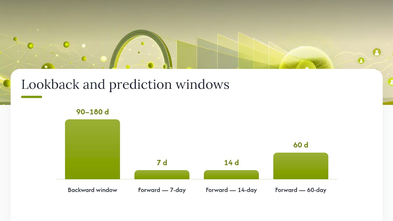
A backward window is the lookback period you use to build features, paired with a forward window that defines how far ahead you're predicting. If your forward window is only seven days, your retention team has almost no time to act before the customer is already gone. Practitioners should calculate the actual time required to execute an intervention, whether that's a phone call, an email sequence, or an account review, and design the prediction window around that operational reality, not around whatever produces the best model score in a notebook.
Here's a practical sequence for building the pipeline:
- Define the label window first. Decide your forward-looking churn definition (e.g., "canceled within 60 days") before touching features, since it determines everything downstream.
- Build the backward window. Pull 90 to 180 days of history per customer, feature by feature, aligned to the same point in time to avoid leakage.
- Engineer temporal and interaction features. RFM-style aggregates (recency, frequency, monetary value), session-length trends, and ratios like "tickets per active day" often outperform raw counts alone.
- Address class imbalance deliberately. Churn is almost always the minority class, sometimes 5% or less of the base, and a naive model will happily predict "no churn" for everyone and still post decent accuracy.
- Validate with temporal splits, not random shuffles. Random cross-validation leaks future information into training and inflates every metric you report.
For imbalance specifically, three techniques dominate production pipelines: SMOTE (synthetic minority oversampling), stratified sampling to preserve class ratios across folds, and focal loss for neural approaches that down-weights easy negatives during training. Microsoft's own end-to-end churn tutorial uses SMOTE alongside LightGBM specifically because unbalanced training data causes production models to default toward predicting "no churn" for nearly everyone, a failure mode that looks fine on accuracy and terrible on every metric that actually matters to the business.
Pro Tip: Run a version of your model with a 14-day forward window and another with a 60-day window. If your retention team can't execute a save play inside the shorter window, the accuracy of that model is irrelevant. Design for the window your team can actually act on.
Which Metrics Actually Prove a Churn Model Works?
AUROC is the metric everyone reports and the metric that misleads almost everyone reporting it. On a dataset where churners make up 5% of the base, a model can post a respectable AUROC while still being nearly useless for prioritizing outreach, because AUROC treats false positives and false negatives symmetrically across a threshold range your retention team will never actually use.
PR-AUC (precision-recall area under the curve) and Precision@k tend to be far more honest metrics for imbalanced churn problems. Precision@k answers the question your VP of retention is actually asking: "Of the top 200 customers we flag this week, how many will genuinely churn if we do nothing?" That's the number that determines whether your customer success team trusts the model or quietly stops using it after two bad lists.
Calibration matters just as much, and gets skipped constantly. A model can rank customers correctly relative to each other while producing probability scores that are wildly off in absolute terms, saying "80% churn risk" for a cohort that actually churns at 30%. If your intervention thresholds are set on raw scores ("call anyone above 0.7"), miscalibration will systematically misallocate your team's time.
A sound evaluation protocol includes:
- Temporal holdouts, not random splits, so the test set represents a genuinely future period.
- Cohort validation across customer segments (new vs. tenured, enterprise vs. self-serve) to catch models that only work for your easiest segment.
- Backward-window coverage checks: what percentage of eventual churners does the model flag with enough lead time to act, not just eventually?
- Offline-to-online testing before full rollout, comparing model-flagged cohorts against a holdout that receives no intervention.
The benchmark study behind the Springer explainability paper found that strong tabular learners like XGBoost paired with SHAP delivered both competitive accuracy and explanations operators could actually act on, which is the real bar. A model nobody trusts enough to act on is a model that isn't working, regardless of its leaderboard score.
How Do You Turn a Churn Score Into an Action Your Team Can Trust?
A probability score with no explanation is a black box, and black boxes don't survive contact with a skeptical customer success director. Interpretability isn't a nice academic add-on here. It's frequently the actual business requirement that determines whether a model gets adopted at all.
SHAP (Shapley Additive Explanations) and LIME (Local Interpretable Model-Agnostic Explanations) solve this by breaking a single prediction down into the specific factors that drove it. A SHAP summary plot tells you, across your whole customer base, that support ticket volume and login decline are your top two churn drivers. A local SHAP explanation tells you, for one specific account flagged at 82% risk, that it's driven by a 40% drop in weekly logins and two unresolved tickets, which is exactly what a customer success rep needs to open a conversation that doesn't feel generic.
The research on explainable tabular models backs this up directly: pairing top-performing learners with SHAP produces high accuracy alongside actionable explanations that operators can genuinely use, rather than a score they have to take on faith.
Turning that into a repeatable playbook takes a few deliberate steps:
- Translate SHAP drivers into plain-language rules ("flag if login frequency drops more than 50% over 30 days and support tickets exceed two") that non-technical teams can apply without touching the model.
- Assign specific playbooks to specific driver combinations, since a billing-driven flag and an engagement-driven flag need entirely different outreach.
- Monitor explanation drift over time. If SHAP's top features shift quarter over quarter, your underlying customer behavior has changed and your playbooks need to change with it.
Pro Tip: Don't just hand your CS team a risk score. Hand them the top two SHAP drivers in plain English. "This account is flagged because usage dropped 45% and they filed three tickets" gets acted on. "Risk score: 0.79" gets ignored.
How Do You Deploy and Maintain a Churn Model in Production?
A model sitting in a Jupyter notebook saves nobody. The operational loop, score, trigger, measure, retrain, is what converts a prediction into recovered revenue, and it's the step most teams underbuild.
Scoring cadence depends on how fast your product moves. A high-usage SaaS product with daily engagement data can justify near-real-time streaming scores. A B2B contract business renewing annually is usually fine with weekly or even monthly batch scoring, which is simpler to maintain and audit. Feature freshness is the real constraint either way: a model scoring on 30-day-stale support ticket data is worse than no model at all, because it creates false confidence.
The trigger mechanics matter as much as the score itself:
- Set a risk threshold tied to team capacity, not an arbitrary round number, since flagging 500 "high risk" accounts against a team that can call 50 a week guarantees most flags go stale.
- Route by driver, not just score, sending billing-driven risk to automated dunning flows and engagement-driven risk to human outreach.
- Run randomized holdouts on a subset of flagged accounts to measure true incremental lift rather than assuming every save was caused by the intervention.
- Feed campaign outcomes back into the training set, since a customer who was flagged, contacted, and stayed is a labeled data point your next model iteration needs.
| Deployment factor | Batch scoring | Streaming scoring |
|---|---|---|
| Typical cadence | Daily to weekly | Near real time |
| Best fit | Contract/B2B renewals | High-frequency usage products |
| Infrastructure cost | Lower | Higher |
| Feature freshness risk | Moderate | Low |
Retraining cadence should follow concept drift, not the calendar. If precision at your top decile starts sliding, or your SHAP driver rankings shift meaningfully, that's your signal to retrain, not a fixed quarterly date. Pairing quantitative flags with qualitative follow-up, actual conversations with flagged customers, also surfaces the "why" behind the "who," which sharpens both your interventions and your next round of features. A tool like Prowl can help surface and route at-risk accounts to the right agents once your scoring pipeline is live.
What Should You Prioritize First When Building This Out?
Fix involuntary churn before you build anything sophisticated. Payment retry logic and dunning emails are cheap, fast to implement, and typically recover revenue within weeks, long before your first relational model is even validated. Once that's handled, the sequence I'd recommend is onboarding friction next, since early-tenure churn is usually the highest-volume, most fixable segment, and only then relational or graph-based investment once you've exhausted the gains available from flat-table features.
The business case only lands, though, when you tie predicted saves directly to unit economics. A saved customer isn't just "retained." It's incremental LTV against a CAC you already spent, which means your LTV:CAC ratio should be the frame you present to leadership, not model accuracy:
- Calculate cost-per-save (intervention cost divided by incrementally retained customers) against average customer LTV.
- Present retention wins in payback-period terms, since that's the language that gets budget approved.
- Use a growth calculator to model how a 5-point churn reduction shifts your blended CAC payback timeline before you pitch the investment.
Where to Learn the Technical Implementation
Microsoft's Fabric churn tutorial walks through the full pipeline end to end: LightGBM training, SMOTE for imbalance, MLflow experiment tracking, and Power BI reporting. The MDPI review of ensemble and deep-learning approaches benchmarks performance across telecom, insurance, and ISP datasets. For relational modeling expectations, the Kumo sets realistic AUROC baselines for flat versus graph-based approaches.
What I'd Tell a Leadership Team Building Their First Churn Model
Most companies chase model accuracy when they should be chasing actionable lead time, because a perfect prediction delivered three days before cancellation saves nobody, while a mediocre prediction delivered thirty days out gives a real team a real shot. That's the whole game.
For the first 90 days, I'd run three moves in sequence: diagnose your highest-volume churn cohort using the leading indicators already sitting in your product and support data, run one narrowly targeted intervention against that cohort with a randomized holdout attached, and measure lift against that holdout before you spend another dollar on model sophistication. Get that loop working once, cheaply, before you build anything resembling a graph neural network. If you want help building that loop properly, from funnel diagnostics through to a retention system that compounds, that's precisely the kind of growth architecture Asha Frazier builds for companies ready to stop guessing.
— Asha
Sources
- Nature article (2026) — ensemble churn prediction performance
- Explainable churn prediction in telecom with tabular ML five model benchmark and SHAP analysis (Springer, 2026)
- Tutorial: create, evaluate, and score a churn prediction model - Microsoft Fabric | Microsoft Learn
- Kumo
Recommended
- Retention Marketing: How to Reduce Churn and Maximize Customer Lifetime Value — Asha Frazier
- The 60-Day Turnaround: Taking a Cash-Burning DTC Brand to a $100M Exit — Asha Frazier
- Marketplace Growth: When to Push Supply vs. Demand (And What Actually Compounds) — Asha Frazier
- The Boring Science of Scaling: How to Engineer Predictable Revenue from Seed to $100M+ — Asha Frazier